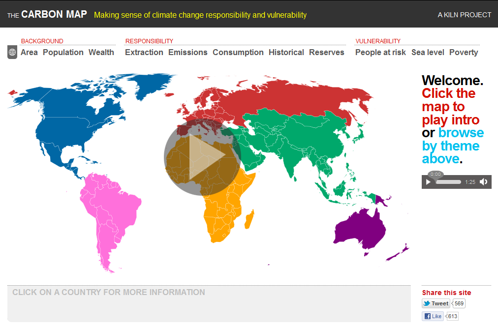
Welcome to The Carbon Map (click to view). Its aim: to make sense of climate change responsibility and vulnerability. The site uses interactive cartograms (maps distorted to reflect a dataset) to convey how different countries fit into the climate change picture – both causes and risks. It was created as an entry for the World Bank’s Apps for Climate Competition. It was created by Duncan Clark and Robin Houston of Kiln.
The various World Bank data sets that the map deploys information from has per country and regional breakdowns under 11 indicators for exploring:
| Background |
|
| Responsibility |
|
| Vulnerability |
|
The interactive map is also available for any non-commercial purpose and can be downloaded for free here for offline use in, for example, classrooms or groupwork. For full information on the map and how it is produced, see here. A full list of all the data sources is also available.

